INNOVATIVE MININGForan Mining
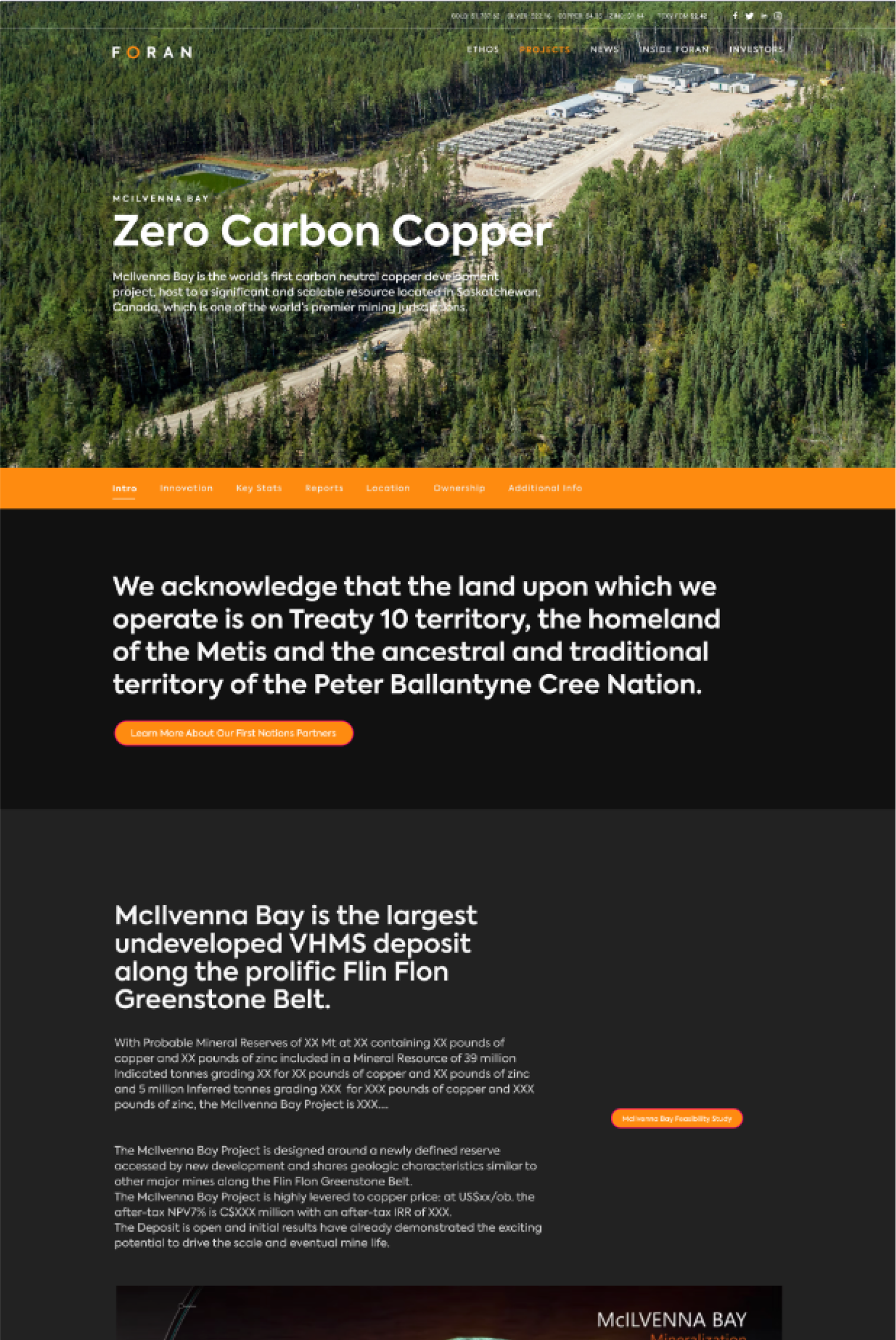
VISUAL IDENTITY, ILLUSTRATIONS, ICONOGRAPHY, UI DESIGNForan is a new kind of mining company. One built for the future that operates on solid values, daring ideas, and bold actions. We created a high-impact brand identity and a professional website that reflect their values and beliefs.
*Project as part of Denman Digital.
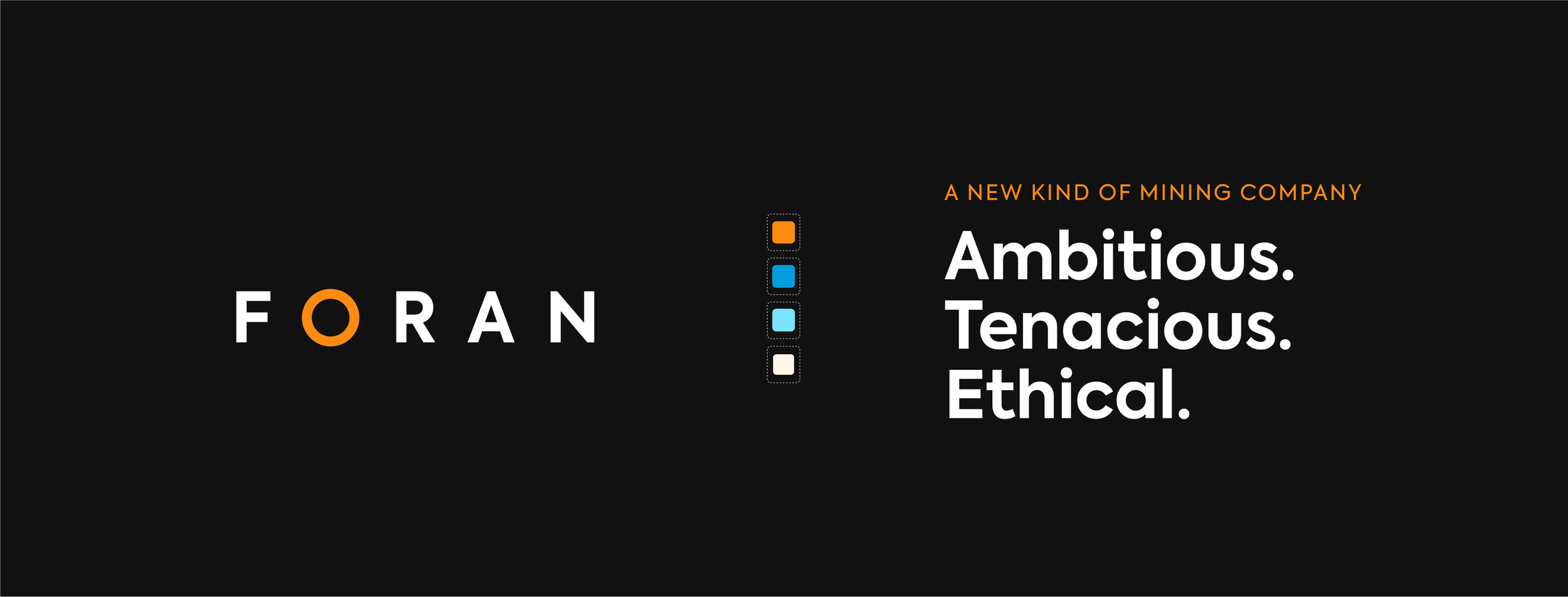
Visual Identity
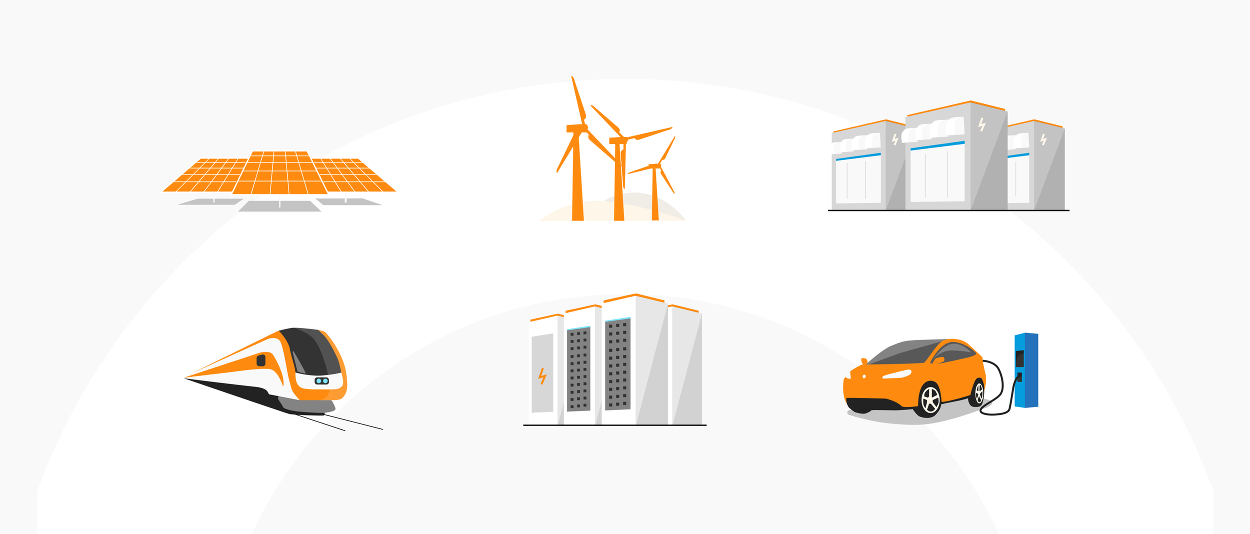
The brand identity is based on the ideas of innovation, commitment, and energy. We designed a logomark that had a sense of strong simplicity. The O illustrates the idea of a cycle, renewability and infinity, and is being used throughout the visual identity. An energetic orange was chosen as the primary colour, paired with nice blues and a beige to evoke knowledge and trust.
Website
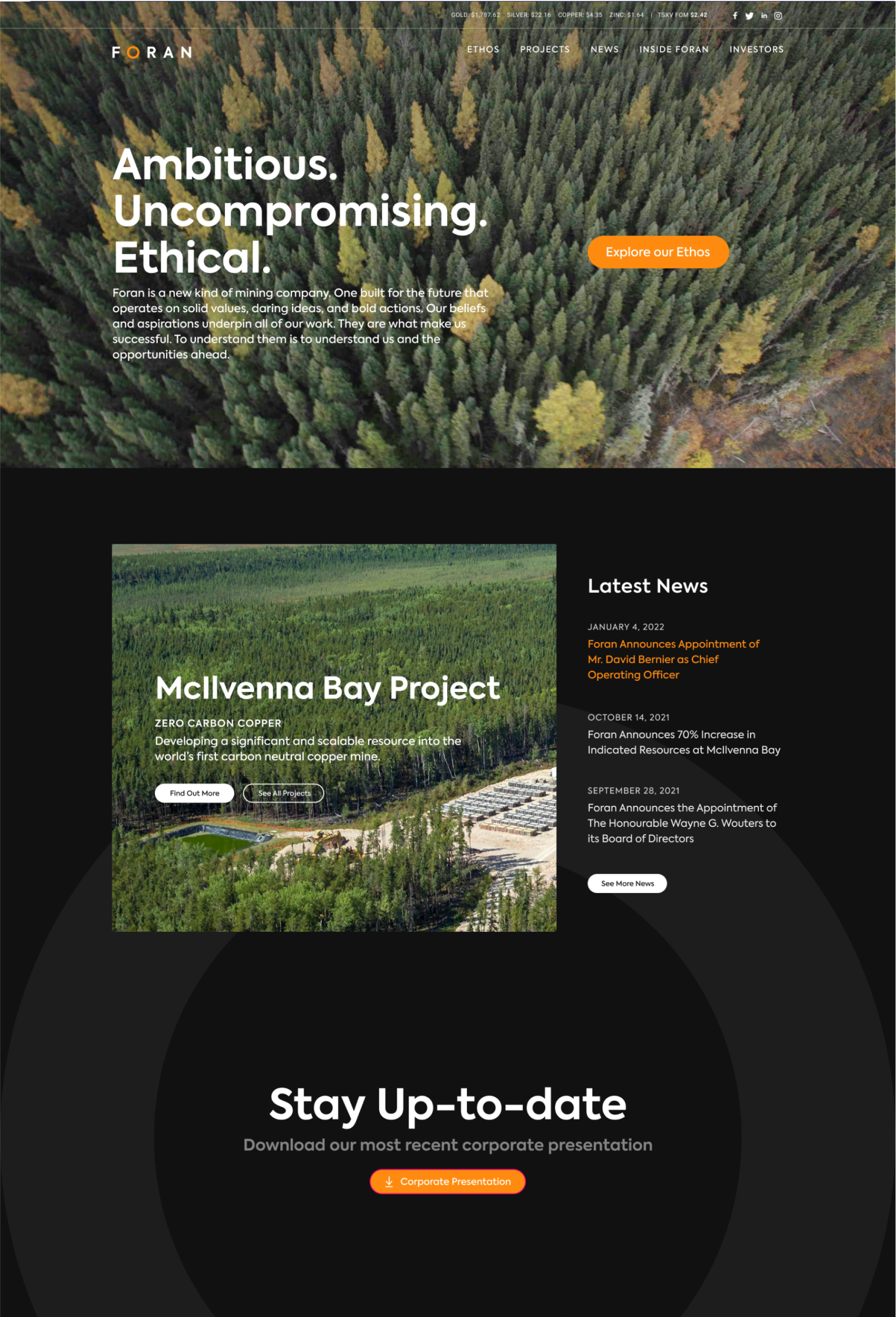
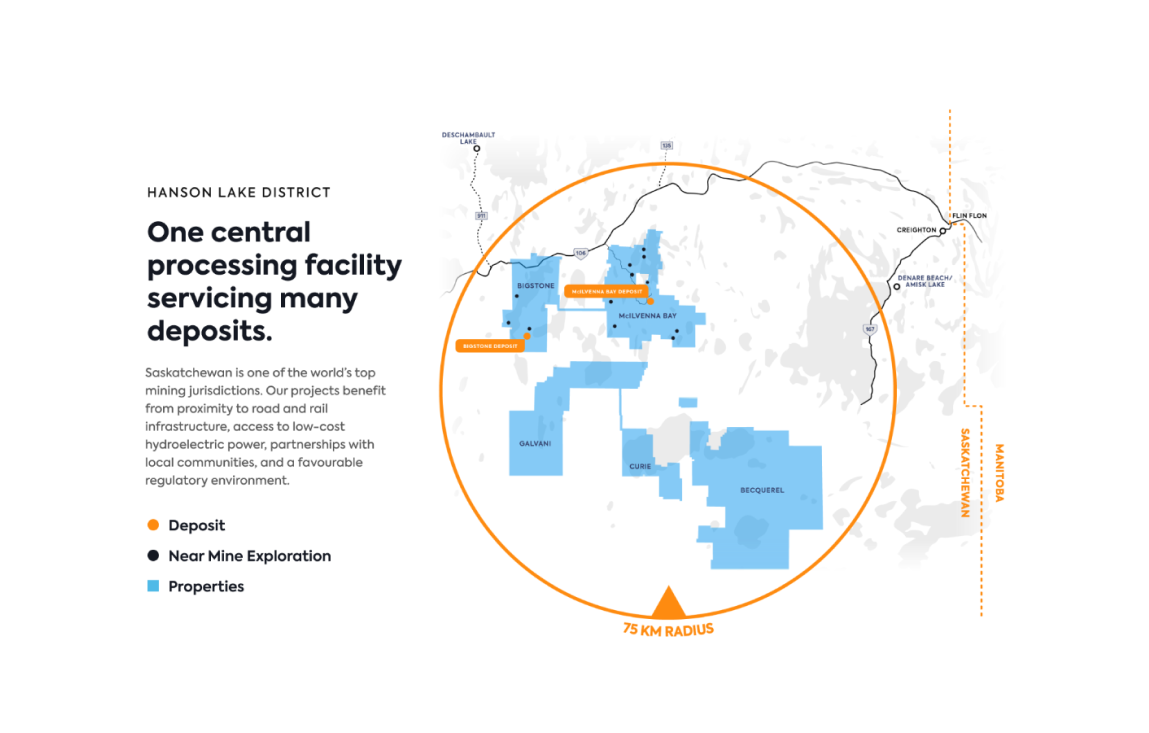
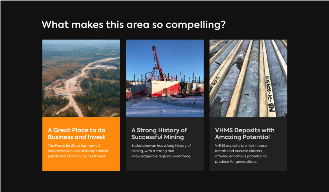
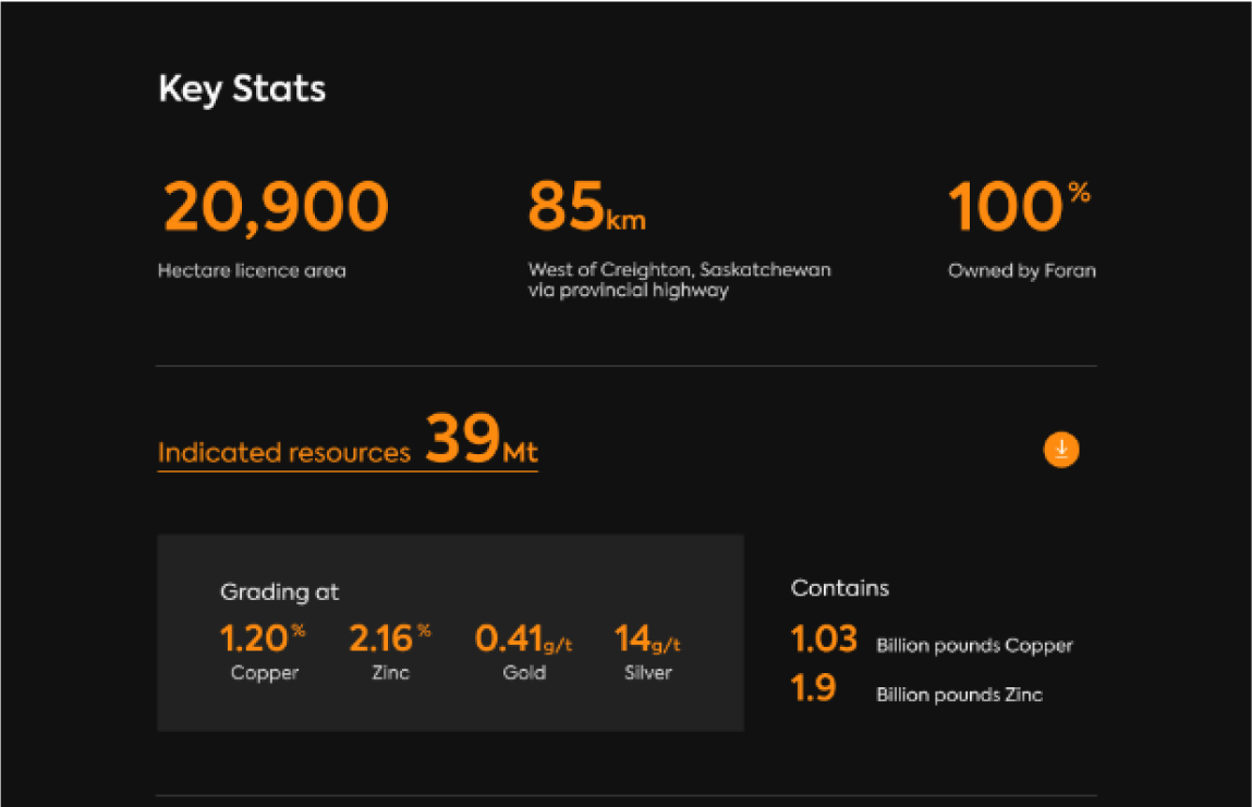
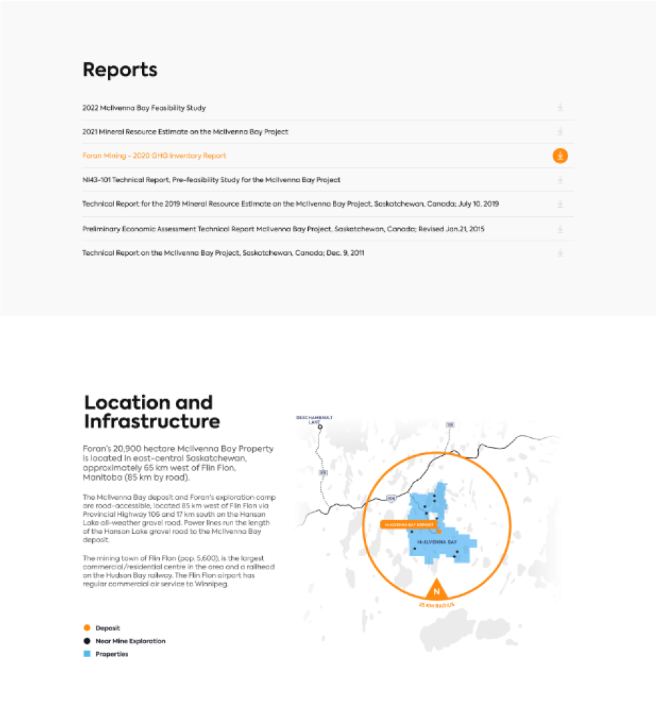
The goal of the website was to display a lot of mining information for future investors. We played with bold type, dark backgrounds and smart uses of the primary colours to display information in a modern way. Immersive videos were also created to use in some headers.
